Logo Refinements
DESIGN RATIONALE
Overview
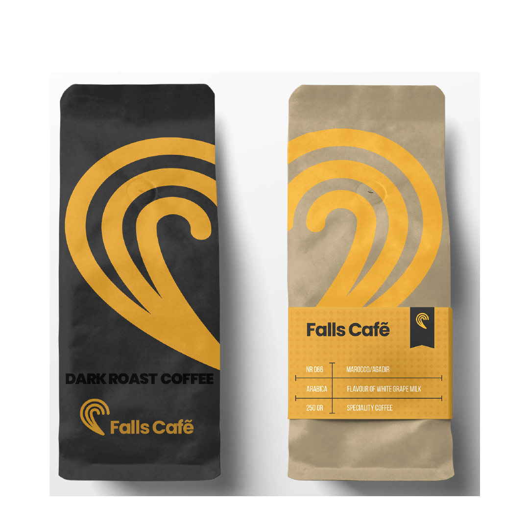
This project was to create a logo identity of a coffee shop located in Niagara Falls. This coffee shop is selling not only premade coffee but signature bulk coffee.
It is very unique made specify here in Niagara Falls. The logo is symmetrical with two meanings, waves from the falls and once combine side by side logo resembling the shape of a heart. The heart represents romantic love and affection. Many tourists pick Niagara fall destination for their honeymoon. This logo is suitable for its identity. The colours are yellow and gray ironically; these two colours are the colour of the year according to Pantone.
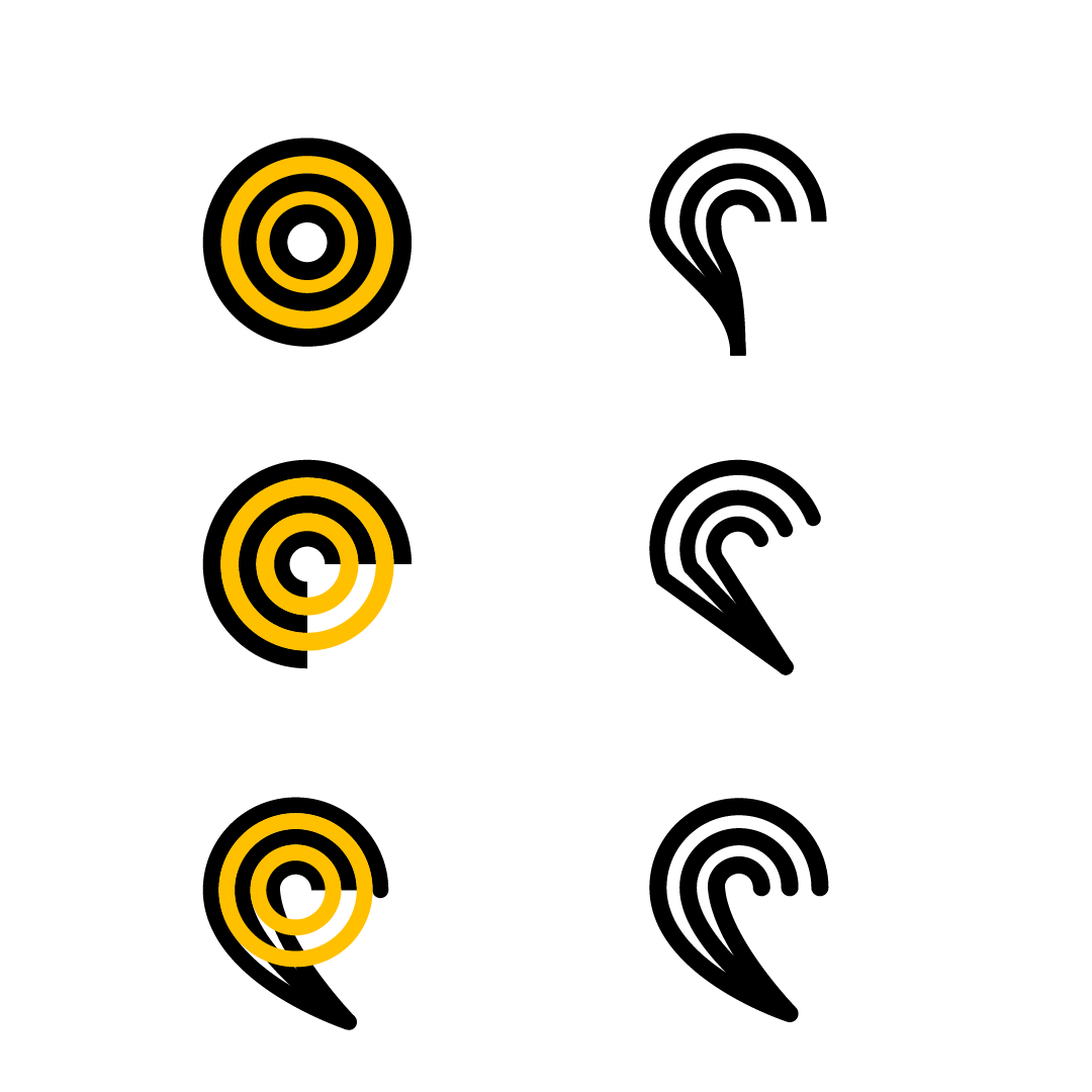
Logo Meaning
Symmetry design. it has two meaning a wave that represents the falls and heart once combine side by side
Logo
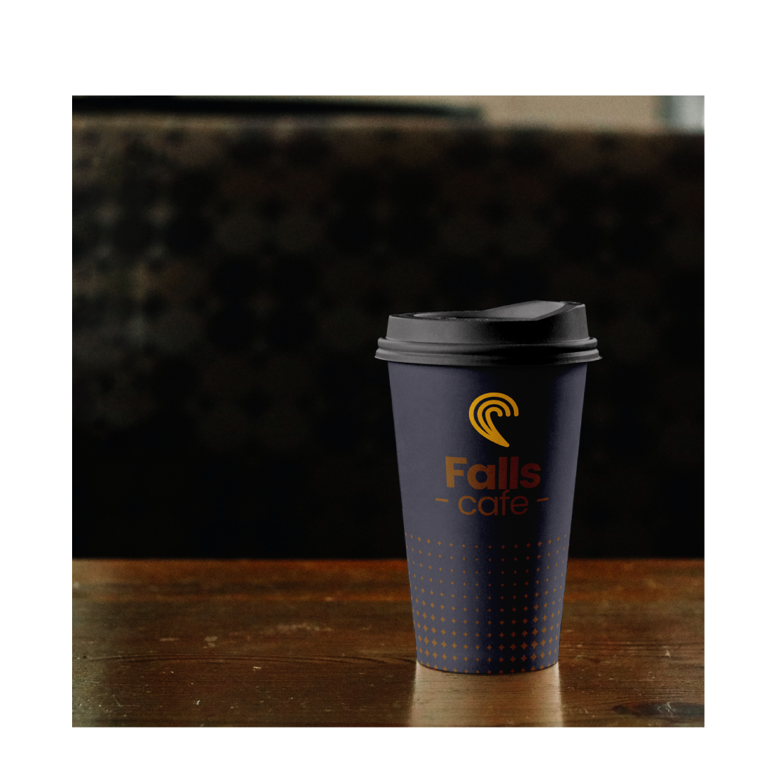
Coffe Cup
Bulk Packaging Design